Dotplots and histograms are both graphical displays that can be used with one quantitative variable. Below are descriptions for each along with some examples and instructions for constructing each in Minitab.
Dotplots Section
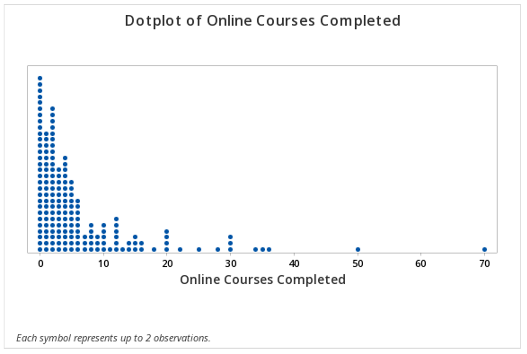
A dotplot can also be used to display data concerning one interval- or ratio-level variable. Each dot represents one, or more, data points. In the first example below, each dot represents one observation.
In this second example, the key at the bottom tells us that each dot may represent up to 2 observations.
Later in the course, in Lessons 4 and 5, we will study statistical inference and the application we will use will rely heavily on dotplots. For example, we will use dotplots to determine the proportion of points greater than, less than, or between two values. This can be determined by counting the dots.
Minitab® – Dotplot
This example will use data collected from a sample of students enrolled in online sections of STAT 200 during the Summer 2020 semester. These data can be downloaded as a CSV file:
To create a dotplot of the number of online courses completed:
- Open the data set in Minitab
- From the tool bar, select Graph > Dotplot...
- Under One Y Variable, select Simple
- Click OK
- Double click the variable Online Courses Completed in the box on the left to insert it into the Y-variable box on the right
- Click OK
This should result in the following dotplot:
Minitab®
Histograms Section
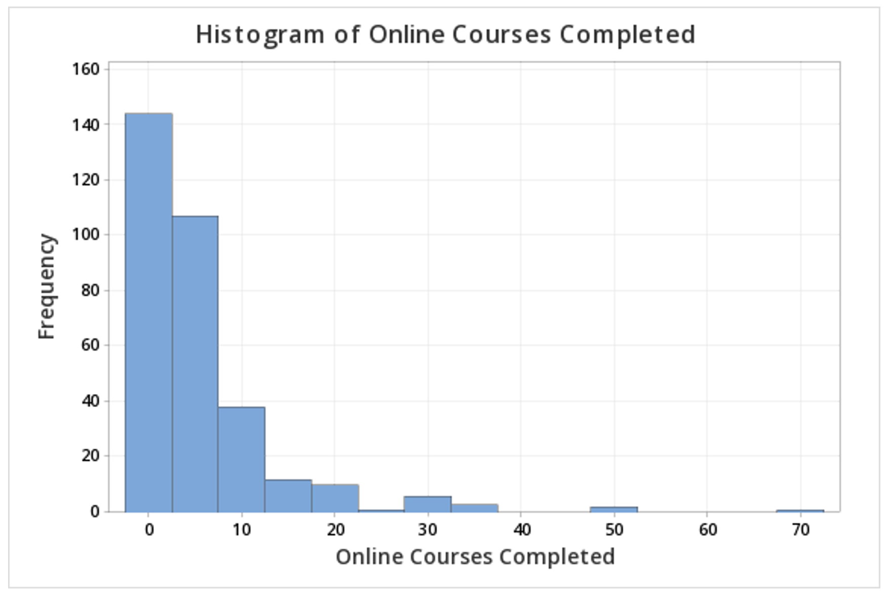
This example will use data collected from a sample of students enrolled in online sections of STAT 200 during the Summer 2020 semester. These data can be downloaded as a CSV file:
To create a histogram of the number of online courses completed in Minitab:
- Open the data set in Minitab
- From the tool bar, select Graph > Histogram...
- Under One Y Variable, select Simple
- Click OK
- Double click the variable Online Courses Completed in the box on the left to insert it into the Y-variable box on the right
- Click OK
This should result in the following histogram: