Often times we want to compare groups in terms of a quantitative variable. For example, we may want to compare the heights of males and females. In this case height is a quantitate variable while biological sex is a categorical variable. Graphs with groups can be used to compare the distributions of heights in these two groups. Below you will find examples of constructing side-by-side boxplots, dotplots with groups, and histograms with groups using Minitab. The side-by-side boxplots allow us to easily compare the median, IQR, and range of the two groups. The dotplots with groups and histograms with groups allow us to compare the shape, central tendency, and variability of the two groups.
Minitab®
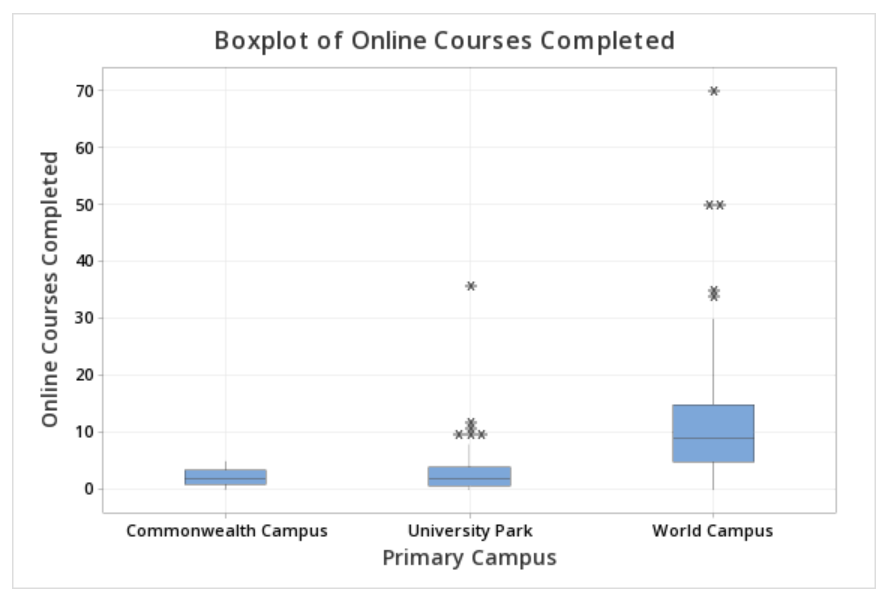
Side-by-Side Boxplots Section
This example will use data collected from a sample of students enrolled in online sections of STAT 200.
To create a side-by-side boxplots of Online Courses Completed by Primary Campus in Minitab:
- Open the data file in Minitab
- Select Graph > Boxplot... > One Y Variable > With Categorical Groups
- Double click the variable Online Courses Completed in the box on the left to insert it into the Y variable box on the right
- Double click the variable Campus in the box on the left to insert it into the Group variable box on the right
- Click OK
This should result in the following side-by-side boxplots:
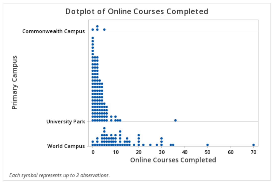
Minitab® – Dotplots with Groups
This example will use data collected from a sample of students enrolled in online sections of STAT 200.
To create a dotplot with groups in Minitab :
- Open the data file in Minitab
- From the tool bar, select Graph > Dotplot... > One Y Variable > Groups Displayed on the Scale
- Double click the variable Online Courses Completed in the box on the left to insert it into the Y variable box on the right
- Double click the variable Primary Campus in the box on the left to insert it into the Group variable box on the right
- Click OK
This should result in the following dotplot with groups:
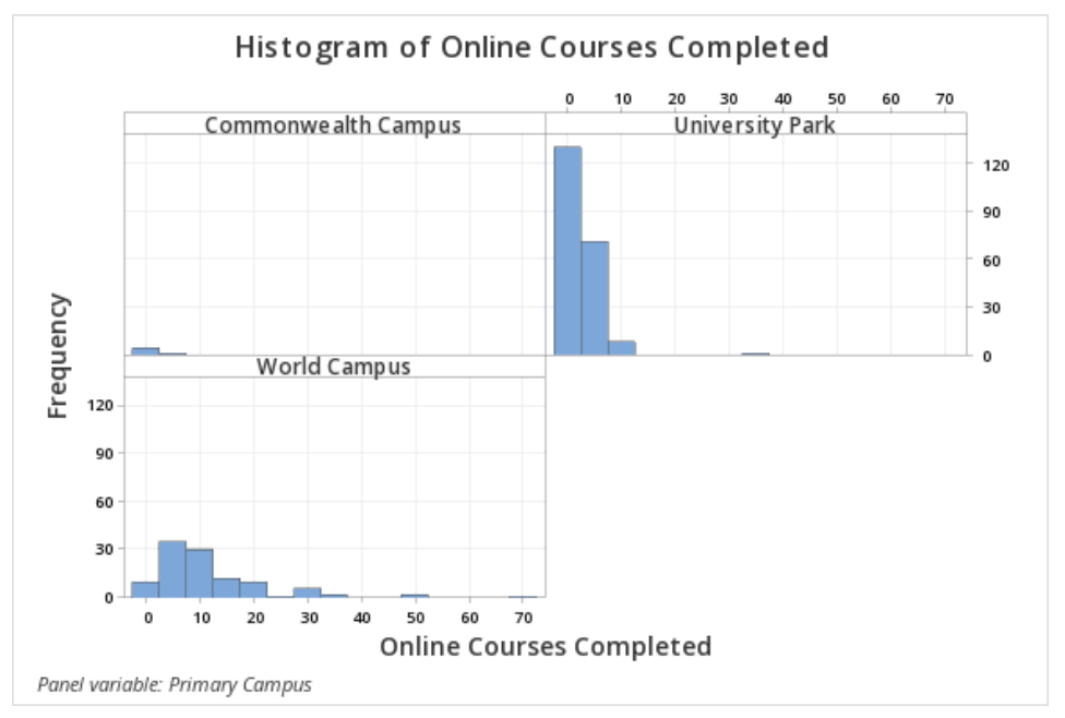
Minitab® – Histograms with Groups
This example will use data collected from a sample of students enrolled in online sections of STAT 200.
To create histograms with groups in Minitab :
- Open the data file in Minitab
- From the tool bar, select Graph > Histogram... > One Y Variable > Groups Displayed Separately
- Double click the variable Online Courses Completed in the box on the left to insert it into the Y-variable box on the right
- Double click the variable Primary Campus in the box on the left to insert it into the Group variables box on the right
- Click OK
This should result in the histogram with groups below: