Unfortunately, the coefficient of determination \(R^{2}\) and the correlation coefficient r have to be the most often misused and misunderstood measures in the field of statistics. To ensure that you don't fall victim to the most common mistakes, we review a set of seven different cautions here. Master these and you'll be a master of the measures!
Cautions Section
Caution #1
The coefficient of determination \(R^{2}\) and the correlation coefficient r quantify the strength of a linear relationship. It is possible that \(R^{2}\) = 0% and r = 0, suggesting there is no linear relation between x and y, and yet a perfect curved (or "curvilinear" relationship) exists.
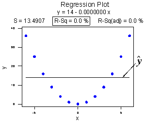
Consider the following example. The upper plot illustrates a perfect, although curved, relationship between x and y, and yet Minitab reports that \(R^{2} = 0\%\) and r = 0. The estimated regression line is perfectly horizontal with slope \(b_{1} = 0\). If you didn't understand that \(R^{2}\) and r summarize the strength of a linear relationship, you would likely misinterpret the measures, concluding that there is no relationship between x and y. But, it's just not true! There is indeed a relationship between x and y — it's just not linear.
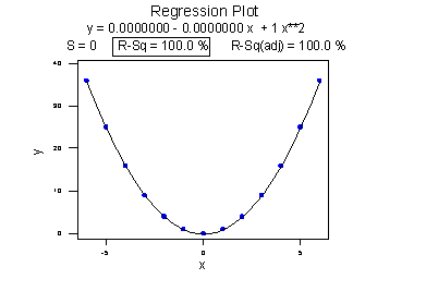
The lower plot better reflects the curved relationship between x and y. Minitab has drawn a quadratic curve through the data, and reports that "R-sq = 100.0%" and r = 0. What is this all about? We'll learn when we study multiple linear regression later in the course that the coefficient of determination \(R^{2}\) associated with the simple linear regression model for one predictor extends to a "multiple coefficients of determination," denoted \(R^{2}\), for the multiple linear regression model with more than one predictor. (The lowercase r and uppercase R are used to distinguish between the two situations. Minitab doesn't distinguish between the two, calling both measures "R-sq.") The interpretation of \(R^{2}\) is similar to that of \(r^{2}\), namely "\(R^{2} \times 100\%\) of the variation in the response is explained by the predictors in the regression model (which may be curvilinear)."
In summary, the \(R^{2}\) value of 100% and the r value of 0 tell the story of the second plot perfectly. The multiple coefficients of determination \(R^{2} = 100\%\) tell us that all of the variations in the response y are explained in a curved manner by the predictor x. The correlation coefficient r = 0 tells us that if there is a relationship between x and y, it is not linear.
Caution #2
A large \(R^{2}\) value should not be interpreted as meaning that the estimated regression line fits the data well. Another function might better describe the trend in the data.
Consider the following example in which the relationship between years (1790 to 1990, by decades) and the population of the United States (in millions) is examined:
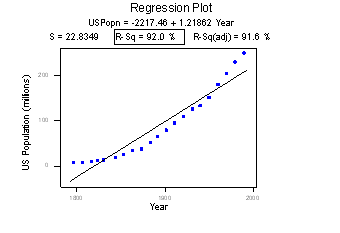
The correlation of 0.959 and the \(R^{2}\) value of 92.0% suggest a strong linear relationship between the year and the U.S. population. Indeed, only 8% of the variation in the U.S. population is left to explain after taking into account the year in a linear way! The plot suggests, though, that a curve would describe the relationship even better. That is, the large \(R^{2}\) value of 92.0% should not be interpreted as meaning that the estimated regression line fits the data well. (Its large value does suggest that taking into account the year is better than not doing so. It just doesn't tell us that we could still do better.)
Again, the \(R^{2}\) value doesn't tell us that the regression model fits the data well. This is the most common misuse of the \(R^{2}\) value! When you are reading the literature in your research area, pay close attention to how others interpret \(R^{2}\). I am confident that you will find some authors misinterpreting the \(R^{2}\) value in this way. And, when you are analyzing your own data make sure you plot the data — 99 times out of 100, the plot will tell more of the story than a simple summary measure like r or \(R^{2}\) ever could.
Caution #3
The coefficient of determination \(R^{2}\) and the correlation coefficient r can both be greatly affected by just one data point (or a few data points).
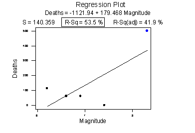
Consider the following example in which the relationship between the number of deaths in an earthquake and its magnitude is examined. Data on n = 6 earthquakes were recorded, and the fitted line plot on the left was obtained. The slope of the line \(b_{1} = 179.5\) and the correlation of 0.732 suggest that as the magnitude of the earthquake increases, the number of deaths also increases. This is not a surprising result. Therefore, if we hadn't plotted the data, we wouldn't notice that one and only one data point (magnitude = 8.3 and deaths = 503) was making the values of the slope and the correlation positive.
Original plot
Plot with the unusual point removed
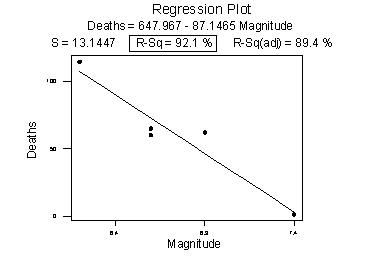
The second plot is a plot of the same data, but with that one unusual data point removed. Note that the estimated slope of the line changes from a positive 179.5 to a negative 87.1 — just by removing one data point. Also, both measures of the strength of the linear relationship improve dramatically — r changes from a positive 0.732 to a negative 0.960, and \(R^{2}\) changes from 53.5% to 92.1%.
What conclusion can we draw from these data? Probably none! The main point of this example was to illustrate the impact of one data point on the r and \(R^{2}\) values. One could argue that a secondary point of the example is that a data set can be too small to draw any useful conclusions.
Caution #4
Correlation (or association) does not imply causation.
Consider the following example in which the relationship between wine consumption and death due to heart disease is examined. Each data point represents one country. For example, the data point in the lower right corner is France, where the consumption averages 9.1 liters of wine per person per year, and deaths due to heart disease are 71 per 100,000 people.
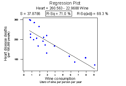
Minitab reports that the \(R^{2}\) value is 71.0% and the correlation is -0.843. Based on these summary measures, a person might be tempted to conclude that he or she should drink more wine since it reduces the risk of heart disease. If only life were that simple! Unfortunately, there may be other differences in the behavior of the people in the various countries that really explain the differences in the heart disease death rates, such as diet, exercise level, stress level, social support structure, and so on.
Let's push this a little further. Recall the distinction between an experiment and an observational study:
- An experiment is a study in which, when collecting the data, the researcher controls the values of the predictor variables.
- An observational study is a study in which, when collecting the data, the researcher merely observes and records the values of the predictor variables as they happen.
The primary advantage of conducting experiments is that one can typically conclude that differences in the predictor values are what caused the changes in the response values. This is not the case for observational studies. Unfortunately, most data used in regression analyses arise from observational studies. Therefore, you should be careful not to overstate your conclusions, as well as be cognizant that others may be overstating their conclusions.
Caution #5
Ecological correlations — correlations that are based on rates or averages — tend to overstate the strength of an association.
Some statisticians (Freedman, Pisani, Purves, 1997) investigated data from the 1988 Current Population Survey in order to illustrate the inflation that can occur in ecological correlations. Specifically, they considered the relationship between a man's level of education and his income. They calculated the correlation between education and income in two ways:
- First, they designated individual men, aged 25-64, as the experimental units. That is, each data point represented a man's income and education level. Using these data, they determined that the correlation between income and education level for men aged 25-64 was about 0.4, not a convincingly strong relationship.
- The statisticians analyzed the data again, but in the second go-around, they treated nine geographical regions as the units. That is, the first computed the average income and average education for men aged 25-64 in each of the nine regions. They determined that the correlation between the average income and average education for the sample of n = 9 regions was about 0.7, obtaining a much larger correlation than that obtained on the individual data.
Again, ecological correlations, such as the one calculated on the region data, tend to overstate the strength of an association. How do you know what kind of data to use — aggregate data (such as regional data) or individual data? It depends on the conclusion you'd like to make.
If you want to learn about the strength of the association between an individual's education level and his income, then, by all means, you should use individual, not aggregate, data. On the other hand, if you want to learn about the strength of the association between a school's average salary level and the school's graduation rate, you should use aggregate data in which the units are the schools.
We hadn't taken note of it at the time, but you've already seen a couple of examples in which ecological correlations were calculated on aggregate data:
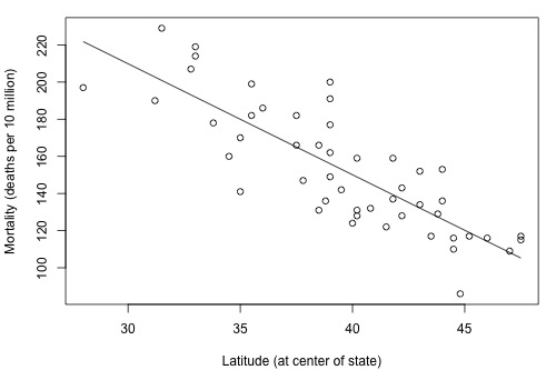
The correlation between wine consumption and heart disease deaths (0.71) is an ecological correlation. The units are countries, not individuals. The correlation between skin cancer mortality and state latitude of 0.68 is also an ecological correlation. The units are states, again not individuals. In both cases, we should not use these correlations to try to draw a conclusion about how an individual's wine consumption or suntanning behavior will affect their individual risk of dying from heart disease or skin cancer. We shouldn't try to draw such conclusions anyway, because "association is not causation."
Caution #6
A "statistically significant" \(R^{2}\) value does not imply that the slope \(β_{1}\) is meaningfully different from 0.
This caution is a little strange as we haven't talked about any hypothesis tests yet. We'll get to that soon, but before doing so ... a number of former students have asked why some article authors can claim that two variables are "significantly associated" with a P-value less than 0.01, yet their \(R^{2}\) value is small, such as 0.09 or 0.16. The answer has to do with the mantra that you may recall from your introductory statistics course: "statistical significance does not imply practical significance."
In general, the larger the data set, the easier it is to reject the null hypothesis and claim "statistical significance." If the data set is very large, it is even possible to reject the null hypothesis and claim that the slope \(β_{1}\) is not 0, even when it is not practically or meaningfully different from 0. That is, it is possible to get a significant P-value when \(β_{1}\) is 0.13, a quantity that is likely not to be considered meaningfully different from 0 (of course, it does depend on the situation and the units). Again, the mantra is "statistical significance does not imply practical significance."
Caution #7
A large \(R^{2}\) value does not necessarily mean that a useful prediction of the response \(y_{new}\), or estimation of the mean response \(\mu_{Y}\), can be made. It is still possible to get prediction intervals or confidence intervals that are too wide to be useful.
We'll learn more about such prediction and confidence intervals in Lesson 3.
Try it!
Cautions about \(R^{2}\) Section
Although the \(R^{2}\) value is a useful summary measure of the strength of the linear association between x and y, it really shouldn't be used in isolation. And certainly, its meaning should not be over-interpreted. These practice problems are intended to illustrate these points.
- A large \(R^{2}\) value does not imply that the estimated regression line fits the data well.
The American Automobile Association has published data (Defensive Driving: Managing Time and Space, 1991) that looks at the relationship between the average stopping distance ( y = distance, in feet) and the speed of a car (x = speed, in miles per hour). The data set Car Stopping data contains 63 such data points.
- Use Minitab to create a fitted line plot of the data. (See Minitab Help Section - Creating a fitted line plot). Does a line do a good job of describing the trend in the data?
- Interpret the \(R^{2}\) value. Does car speed explain a large portion of the variability in the average stopping distance? That is, is the C value large?
- Summarize how the title of this section is appropriate.
1.1 - The plot shows a strong positive association between the variables that curve upwards slightly.
1.2 - \(R^{2}= 87.5%\) of the sample variation in y = StopDist can be explained by the variation in x = Speed. This is a relatively large value.
1.3 - The value of \(R^{2}\) is relatively high but the estimated regression line misses the curvature in the data.
- One data point can greatly affect the \(R^{2}\) value
The McCoo dataset contains data on running back Eric McCoo's rushing yards (mccoo) for each game of the 1998 Penn State football season. It also contains Penn State's final score (score).
- Use Minitab to create a fitted line plot. (See Minitab Help Section - Creating a fitted line plot). Interpret the \(R^{2}\) value, and note its size.
- Remove the one data point in which McCoo ran 206 yards. Then, create another fitted line plot on the reduced data set. Interpret the \(R^{2}\) value. Upon removing the one data point, what happened to the \(R^{2}\) value?
- When a correlation coefficient is reported in research journals, there often is not an accompanying scatter plot. Summarize why reported correlation values should be accompanied by either the scatter plot of the data or a description of the scatter plot.
2.1 - The plot shows a slight positive association between the variables with \(R^{2} = 24.9%\) of the sample variation in y = Score explained by the variation in McCoo.2.2 - \(R^{2}\) decreases to just 7.9% on the removal of the one data point with McCoo = 206 yards.
- Association is not causation!
Association between the predictor x and response y should not be interpreted as implying that x causes the changes in y. There are many possible reasons why there is an association between x and y, including:
- The predictor x does indeed cause the changes in the response y.
- The causal relation may instead be reversed. That is, the response y may cause the changes in predictor x.
- The predictor x is a contributing but not sole cause of changes in the response variable y.
- There may be a "lurking variable" that is the real cause of changes in y but also is associated with x, thus giving rise to the observed relationship between x and y.
- The association may be purely coincidental.
It is not an easy task to definitively conclude the causal relationships in a-c. It generally requires designed experiments and sound scientific justification. e is related to Type I errors in the regression setting. The exercises in this section and the next are intended to illustrate d, that is, examples of lurking variables.
3a. Drug law expenditures and drug-induced deaths
"Time" is often a lurking variable. If two things (e.g. road deaths and chocolate consumption) just happen to be increasing over time for totally unrelated reasons, a scatter plot will suggest there is a relationship, regardless of it existing only because of the lurking variable "time." The data set Drugdea data contains data on drug law expenditures and drug-induced deaths (Duncan, 1994). The data set gives figures from 1981 to 1991 on the U.S. Drug Enforcement Agency budget (budget) and the number of drug-induced deaths in the United States (deaths).
- Create a fitted line plot treating deaths as the response y and budget as the predictor x. Do you think the budget caused the deaths?
- Create a fitted line plot treating budget as the response y and deaths as the predictor x. Do you think the deaths caused the budget?
- Create a fitted line plot treating budget as the response y and year as the predictor x.
- Create a fitted line plot treating deaths as the response y and year as the predictor x.
- What is going on here? Summarize the relationships between budget, deaths, and year and explain why it might appear that as drug-law expenditures increase, so do drug-induced deaths.
3b. Infant death rates and breastfeeding3a.1 - The plot shows a moderate positive association between the variables but with more variation on the right side of the plot.
3a.2 - This plot also shows a moderate positive association between the variables but with more variation on the right side of the plot.
3a.3 - This plot shows a strong positive association between the variables.
3a.4 - This plot shows a moderate positive association that is very similar to the deaths vs budget plot.
3a.5 - Year appears to be a lurking variable here and the variables deaths and budget most likely have little to do with one another.
The data set Infant data contains data on infant death rates (death) in 14 countries (1989 figures, deaths per 1000 of population). It also contains data on the percentage of mothers in those countries who are still breastfeeding (feeding) at six months, as well as the percentage of the population who have access to safe drinking water (water).
- Create a fitted line plot treating death as the response y and feeding as the predictor x. Based on what you see, what causal relationship might you be tempted to conclude?
- Create a fitted line plot treating feeding as the response y and water as the predictor x. What relationship does the plot suggest?
- What is going on here? Summarize the relationships between death, feeding, and water and explain why it might appear that as the percentage of mothers breastfeeding at six months increases, so does the infant death rate.
3b.1 - The plot shows a moderate positive association between the variables, possibly suggesting that as feeding increases, so too does death.
3b.2 - The plot shows a moderate negative association between the variables, possibly suggesting that as water increases, feeding decreases.
3b.3 - Higher values of water tend to be associated with lower values of both feeding and death, so low values of feeding and death tend to occur together. Similarly, lower values of water tend to be associated with higher values of both feeding and death, so high values of feeding and death tend to occur together. Water is a lurking variable here and is likely the real driver behind infant death rates.
- Does a statistically significant P-value for \(H_0 \colon \beta_{1}\) = 0 imply that \(\beta_{1}\) is meaningfully different from 0?
Recall that just because we get a small P-value and therefore a "statistically significant result" when testing \(H_{0} \colon \beta_{1}\) = 0, it does not imply that \(\beta_{1}\) will be meaningfully different from 0. This exercise is designed to illustrate this point. The Practical dataset contains 1000 (x, y) data points.
- Create a fitted line plot and perform a standard regression analysis on the data set. (See Minitab Help Sections Performing a basic regression analysis and Creating a fitted line plot).
- Interpret the \(R^{2}\) value. Does there appear to be a strong linear relation between x and y?
- Use the Minitab output to conduct the test \(H_{0} \colon \beta_{1}\) = 0. (We'll cover this formally in Lesson 2, but for the purposes of this exercise reject \(H_{0}\) if the P-value for \(\beta_{1}\) is less than 0.05.) What is your conclusion about the relationship between x and y?
- Use the Minitab output to calculate a 95% confidence interval for \(\beta_{1}\). (Again, we'll cover this formally in Lesson 2, but for the purposes of this exercise use the formula \(b_{1}\) ± 2 × se (\(b_{1}\)). Since the sample is so large, we can just use a t-value of 2 in this confidence interval formula.) Interpret your interval. Suppose that if the slope \(\beta_{1}\) is 1 or more, then the researchers would deem it to be meaningfully different from 0. Does the interval suggest, with 95% confidence, that \(\beta_{1}\) is meaningfully different from 0?
- Summarize the apparent contradiction you've found. What do you think is causing the contradiction? And, based on your findings, what would you suggest you should always do, whenever possible when analyzing data?
4.1 - The fitted regression equation is y = 5.0062 + 0.09980 x.
4.2 - \(R^{2} = 24.3%\) of the sample variation in y can be explained by the variation in x. There appears to be a moderate linear association between the variables.
4.3 - The p-value is 0.000 suggesting a significant linear association between y and x.
4.4 - The interval is 0.09980 ± 2(0.0058) or (0.0882, 0.1114). Since this interval excludes the researchers’ threshold of 1, \(\beta_1\) is not meaningfully different from 0.
4.5 - The large sample size results in a sample slope that is significantly different from 0, but not meaningfully different from 0. The scatterplot, which should always accompany a simple linear regression analysis, illustrates.
- A large R-squared value does not necessarily imply useful predictions
The Old Faithful dataset contains data on 21 consecutive eruptions of Old Faithful geyser in Yellowstone National Park. It is believed that one can predict the time until the next eruption (next), given the length of time of the last eruption (duration).
- Use Minitab to quantify the degree of linear association between next and duration. That is, determine and interpret the \(R^{2}\) value.
- Use Minitab to obtain a 95% prediction interval for the time until the next eruption if the last eruption lasted 3 minutes. (See Minitab Help Section - Performing a multiple regression analysis - with options). Interpret your prediction interval. (We'll cover Prediction Intervals formally in Lesson 3, so just use your intuitive notion of what a Prediction Interval might mean for this exercise.)
- Suppose you are a "rat race tourist" who knows that you can only spend up to one hour waiting for the next eruption to occur. Is the prediction interval too wide to be helpful to you?
- Is the title of this section appropriate?
5.1 - \(R^{2} = 74.91%\) of the sample variation in the next can be explained by the variation in duration. There is a relatively high degree of linear association between the variables.
5.2 - The 95% prediction interval is (47.2377, 73.5289), which means we’re 95% confident that the time until the next eruption if the last eruption lasted 3 minutes will be between 47.2 and 73.5 minutes.
5.3 - If we can only wait 60 minutes, this interval is too wide to be helpful to us since it extends beyond 60 minutes.