An alternative to the residuals vs. fits plot is a "residuals vs. predictor plot." It is a scatter plot of residuals on the y-axis and the predictor (x) values on the x-axis. For a simple linear regression model, if the predictor on the x-axis is the same predictor that is used in the regression model, the residuals vs. predictor plot offers no new information to that which is already learned by the residuals vs. the fits plot. On the other hand, if the predictor on the x-axis is a new and different predictor, the residuals vs. predictor plot can help to determine whether the predictor should be added to the model (and hence a multiple regression model used instead).
The interpretation of a "residuals vs. predictor plot" is identical to that of a "residuals vs. fits plot." That is, a well-behaved plot will bounce randomly and form a roughly horizontal band around the residual = 0 line. And, no data points will stand out from the basic random pattern of the other residuals.
Here's the residuals vs. predictor plot for the data set's simple linear regression model with arm strength as the response and level of alcohol consumption as the predictor:
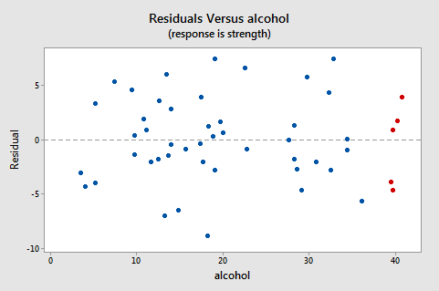
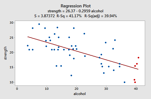
Note that, as defined, the residuals appear on the y-axis and the predictor values — the lifetime alcohol consumptions for the men — appear on the x-axis. Now, you should be able to look back at the scatter plot of the data:
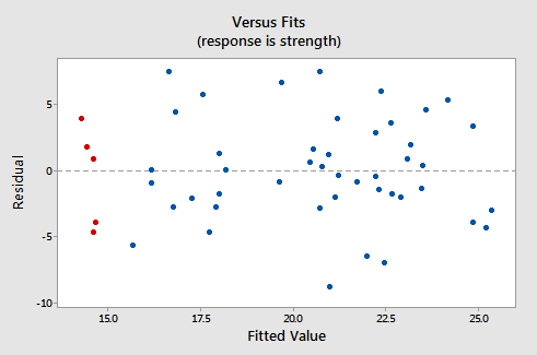
and the residuals vs. fits plot:
to see how the data points there correspond to the data points in the residuals versus predictor plot:
The five red data points should help you out again. The alcohol consumption of the five men is about 40, and hence why the points now appear on the "right side" of the plot. In essence, for this example, the residuals vs. predictor plot is just a mirror image of the residuals vs. fits plot. The residuals vs. predictor plot offers no new information.
Let's take a look at an example in which the residuals vs. predictor plot is used to determine whether or not another predictor should be added to the model. A researcher is interested in determining which of the following — age, weight, and duration of hypertension — are good predictors of the diastolic blood pressure of an individual with high blood pressure. The researcher measured the age (in years), weight (in pounds), duration of hypertension (in years), and diastolic blood pressure (in mm Hg) on a sample of n = 20 hypertensive individuals (Blood Pressure data).
The regression of the response diastolic blood pressure (BP) on the predictor age:
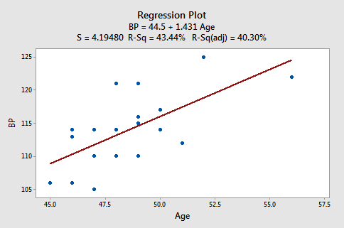
suggests that there is a moderately strong linear relationship \((R^2 = 43.44%)\) between diastolic blood pressure and age. The regression of the response diastolic blood pressure (BP) on the predictor weight:
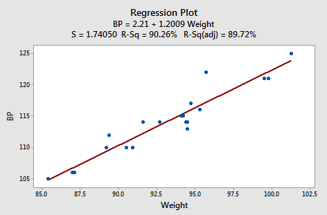
suggests that there is a strong linear relationship (r2 = 90.26%) between diastolic blood pressure and weight. And, the regression of the response diastolic blood pressure (BP) on the predictor duration:
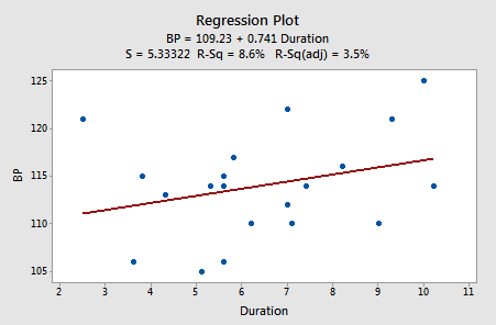
suggests that there is little linear association \((R^2= 8.6%)\) between diastolic blood pressure and the duration of hypertension. In summary, it appears as if the weight has the strongest association with diastolic blood pressure, age has the second strongest association, and duration is the weakest.
Let's investigate various residuals vs. predictors plots to learn whether adding predictors to any of the above three simple linear regression models is advised. Upon regressing blood pressure on age, obtaining the residuals, and plotting the residuals against the predictor weight, we obtain the following "residuals versus weight" plot:
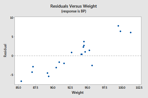
This "residuals versus weight" plot can be used to determine whether we should add the predictor weight to the model that already contains the predictor age. In general, if there is some non-random pattern to the plot, it indicates that it would be worthwhile adding the predictor to the model. In essence, you can think of the residuals on the y-axis as a "new response," namely the individual's diastolic blood pressure adjusted for their age. If a plot of the "new response" against a predictor shows a non-random pattern, it indicates that the predictor explains some of the remaining variability in the new (adjusted) response. Here, there is a pattern in the plot. It appears that adding the predictor weight to the model already containing age would help to explain some of the remaining variability in the response.
We haven't yet learned about multiple linear regression models — regression models with more than one predictor. But, you'll soon learn that it's a straightforward extension of simple linear regression. Suppose we fit the model with blood pressure as the response and age and weight as the two predictors. Should we also add the predictor duration to the model? Let's investigate! Upon regressing blood pressure on weight and age, obtaining the residuals, and plotting the residuals against the predictor duration, we obtain the following "residuals versus duration" plot:
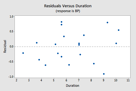
The points on the plot show no pattern or trend, suggesting that there is no relationship between the residuals and duration. That is, the residuals vs. duration plot tells us that there is no sense in adding duration to the model that already contains age and weight. Once we've explained the variation in the individuals' blood pressures by taking into account the individuals' ages and weights, no significant amount of the remaining variability can be explained by the individuals' durations.
Try it! Residual analysis Section
The basic idea (continued)
In the practice problems in the previous section, you created a residuals versus fits plot "by hand" for the data contained in the Residuals dataset. Now, create a residuals versus predictor plot, that is, a scatter plot with the residuals \((e_i)\) on the y-axis and the predictor \((x_i)\) values on the x-axis. (See Minitab Help: Creating a basic scatter plot). In what way — if any — does this plot differ from the residuals versus fit plot you obtained previously?
Using residual plots to help identify other good predictors
To assess physical conditioning in normal individuals, it is useful to know how much energy they are capable of expending. Since the process of expending energy requires oxygen, one way to evaluate this is to look at the rate at which they use oxygen at peak physical activity. To examine peak physical activity, tests have been designed where an individual runs on a treadmill. At specified time intervals, the speed at which the treadmill moves and the grade of the treadmill both increase. The individual is then systematically run to maximum physical capacity. The maximum capacity is determined by the individual; the person stops when unable to go any further. A researcher subjected 44 healthy individuals to such a treadmill test, collecting the following data:
- \(vo_{2}\) (max) = a measure of oxygen consumption, defined as the volume of oxygen used per minute per kilogram of body weight
- dur = how long, in seconds, the individual lasted on the treadmill
- age = age, in years of individual
The data set Treadmill Dataset contains the data on 44 individuals.
-
Fit a simple linear regression model using Minitab's fitted line plot treating \(vo_{2}\) as the response y and dur as the predictor x. (See Minitab Help Section - Creating a fitted line plot). Does there appear to be a linear relationship between \(vo_{2}\) and dur?Yes, there appears to be a strong linear relationship between \(vo_{2}\) and dur based on the scatterplot and r-squared = 81.9%.
-
Fit a simple linear regression model using Minitab's fitted line plot treating \(vo_{2}\) as the response y and age as the predictor x. Does there appear to be a linear relationship between \(vo_{2}\) and age?Yes, there appears to be a moderate linear relationship between \(vo_{2}\) and age based on the scatterplot and r-squared = 44.3%
-
Fit a simple linear regression model using Minitab's fitted line plot treating dur as the response y and age as the predictor x. Does there appear to be a linear relationship between age and dur?Yes, there appears to be a moderate linear relationship between age and dur based on the scatterplot and r-squared = 43.6%.
-
Now, fit a simple linear regression model using Minitab's regression command treating \(vo_{2}\) as the response y and dur as the predictor x. In doing so, request a residuals vs. age plot. (See Minitab Help Section - Creating residual plots). Does the residuals vs. age plot suggest that age would be an additional good predictor to add to the model to help explain some of the variations in \(vo_{2}\)?After fitting a simple linear regression model with \(vo_{2}\) as the response y and dur as the predictor x, the residuals vs. age plot does not suggest that age would be an additional good predictor to add to the model to help explain some of the variations in \(vo_{2}\) since there does not appear to be a strong linear trend in this plot.
-
Now, fit a simple linear regression model using Minitab's regression command treating \(vo_{2}\) as the response y and age as the predictor x. In doing so, request a residuals vs. dur plot. Does the residuals vs. dur plot suggest that dur would be an additional good predictor to add to the model to help explain some of the variations in \(vo_{2}\)?After fitting a simple linear regression model with \(vo_{2}\) as the response y and age as the predictor x, the residuals vs. dur plot suggests that dur could be an additional good predictor to add to the model to help explain some of the variation in \(vo_{2}\) since there is a moderate linear trend in this plot.
-
Summarize what is happening here.Of the two predictors, dur has a stronger linear association with \(vo_{2}\) than age. So, there is no benefit to adding age to a model including dur. However, there is some benefit to adding dur to a model including age. If you do this and fit a multiple linear regression model with both age and dur as the predictors then it turns out that dur is significant (at the 0.05 level) but age is not. In summary, the "best" model includes just dur, but a model with age and dur is better than a model with just age.