When conducting a residual analysis, a "residuals versus fits plot" is the most frequently created plot. It is a scatter plot of residuals on the y-axis and fitted values (estimated responses) on the x-axis. The plot is used to detect non-linearity, unequal error variances, and outliers.
Let's look at an example to see what a "well-behaved" residual plot looks like. Some researchers (Urbano-Marquez, et al., 1989) were interested in determining whether or not alcohol consumption was linearly related to muscle strength. The researchers measured the total lifetime consumption of alcohol (x) on a random sample of n = 50 alcoholic men. They also measured the strength (y) of the deltoid muscle in each person's non-dominant arm. A fitted line plot of the resulting data, (Alcohol Arm data), looks like this:
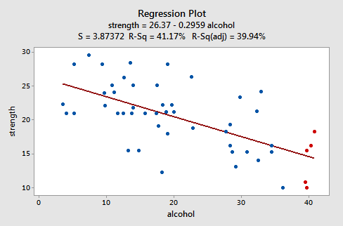
The plot suggests that there is a decreasing linear relationship between alcohol and arm strength. It also suggests that there are no unusual data points in the data set. And, it illustrates that the variation around the estimated regression line is constantly suggesting that the assumption of equal error variances is reasonable.
Here's what the corresponding residuals versus fits plot looks like for the data set's simple linear regression model with arm strength as the response and level of alcohol consumption as the predictor:
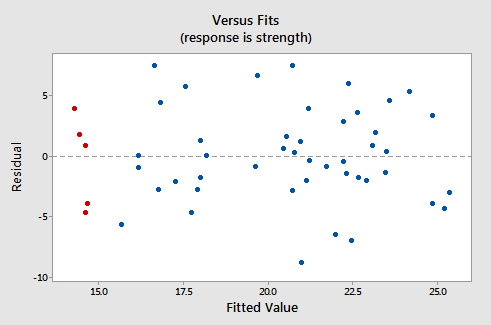
Note that, as defined, the residuals appear on the y-axis and the fitted values appear on the x-axis. You should be able to look back at the scatter plot of the data and see how the data points there correspond to the data points in the residual versus fits plot here. In case you're having trouble with doing that, look at the five data points in the original scatter plot that appears in red. Note that the predicted response (fitted value) of these men (whose alcohol consumption is around 40) is about 14. Also, note the pattern in which the five data points deviate from the estimated regression line.
Now, look at how and where these five data points appear in the residuals versus fits plot. Their fitted value is about 14 and their deviation from the residual = 0 line shares the same pattern as their deviation from the estimated regression line. Do you see the connection? Any data point that falls directly on the estimated regression line has a residual of 0. Therefore, the residual = 0 line corresponds to the estimated regression line.
This plot is a classical example of a well-behaved residual vs. fits plot. Here are the characteristics of a well-behaved residual vs. fits plot and what they suggest about the appropriateness of the simple linear regression model:
- The residuals "bounce randomly" around the residual = 0 line. This suggests that the assumption that the relationship is linear is reasonable.
- The residuals roughly form a "horizontal band" around the residual = 0 line. This suggests that the variances of the error terms are equal.
- No one residual "stands out" from the basic random pattern of residuals. This suggests that there are no outliers.
In general, you want your residual vs. fits plots to look something like the above plot. Don't forget though that interpreting these plots is subjective. My experience has been that students learning residual analysis for the first time tend to over-interpret these plots, looking at every twist and turn as something potentially troublesome. You'll especially want to be careful about putting too much weight on residual vs. fits plots based on small data sets. Sometimes the data sets are just too small to make the interpretation of a residual vs. fits plot worthwhile. Don't worry! You will learn — with practice — how to "read" these plots, although you will also discover that interpreting residual plots like this is not straightforward. Humans love to seek out order in chaos, and patterns in randomness. It's like looking up at the clouds in the sky - sooner or later you start to see images of animals. Resist this tendency when doing graphical residual analysis. Unless something is pretty obvious, try not to get too excited, particularly if the "pattern" you think you are seeing is based on just a few observations. You will learn some numerical methods for supplementing the graphical analyses in Lesson 7. For now, just do the best you can, and if you're not sure if you see a pattern or not, just say that.
Try it! Residual analysis Section
The least squares estimate from fitting a line to the data points in Residual dataset are \(b_{0}\) = 6 and \(b_{1}\) = 3. (You can check this claim, of course).
- Copy x-values in, say, column C1 and y-values in column C2 of a Minitab worksheet.
- Using the least squares estimates, create a new column that contains the predicted values, \(\hat{y}_i\), for each \(x_{i}\) — you can use Minitab's calculator to do this. Select Calc >> Calculator... In the box labeled "Store result in variable", specify the new column, say C3, where you want the predicted values to appear. In the box labeled Expression, type 6+3*C1. Select OK. The predicted values, \(\hat{y}_i\), should appear in column C3. You might want to label this column "fitted." You might also convince yourself that you indeed calculated the predicted values by checking one of the calculations by hand.
- Now, create a new column, say C4, that contains the residual values — again use Minitab's calculator to do this. Select Calc >> Calculator... In the box labeled "Store result in variable", specify the new column, say C4, where you want the residuals to appear. In the box labeled Expression, type C2-C3. Select OK. The residuals, \(e_{i}\), should appear in column C4. You might want to label this column "resid." You might also convince yourself that you indeed calculated the residuals by checking one of the calculations by hand.
- Create a "residuals versus fits" plot, that is, a scatter plot with the residuals (\(e_{i}\)) on the vertical axis and the fitted values (\(\hat{y}_i\)) on the horizontal axis. (See Minitab Help Section - Creating a basic scatter plot). Around what horizontal line (residual = ??) do the residuals "bounce randomly?" What does this horizontal line represent?
Here are the data with fitted values and residuals:
| x | y | fitted | resid |
|---|---|---|---|
| 1 | 10 | 9 | 1 |
| 2 | 13 | 12 | 1 |
| 3 | 7 | 15 | -8 |
| 4 | 22 | 18 | 4 |
| 5 | 28 | 21 | 7 |
| 6 | 19 | 24 | -5 |
And, here is a scatterplot of these residuals vs. the fitted values:
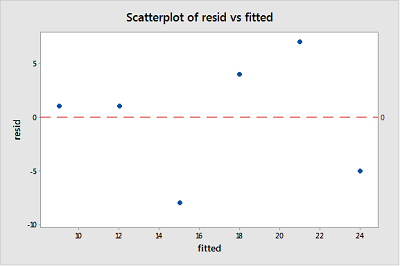
Given the small size, it appears that the residuals bounce randomly around the residual = 0 line. The horizontal line resid = 0 (red dashed line) represents potential observations with residuals equal to zero, indicating that such observations would fall exactly on the fitted regression line.