Although both histograms and normal probability plots of the residuals can be used to graphically check for approximate normality, the normal probability plot is generally more effective. Histograms can be useful for identifying a highly asymmetric distribution, but they don’t tend to be as useful for identifying normality specifically (versus other symmetric distributions) unless the sample size is relatively large. One problem is the sensitivity of a histogram to the choice of breakpoints for the bars - small changes can alter the visual impression quite drastically in some cases. By contrast, the normal probability plot is more straightforward and effective and it is generally easier to assess whether the points are close to the diagonal line than to assess whether histogram bars are close enough to a normal bell curve.
For example, consider the following histogram for a sample of 20 normally-distributed data points:
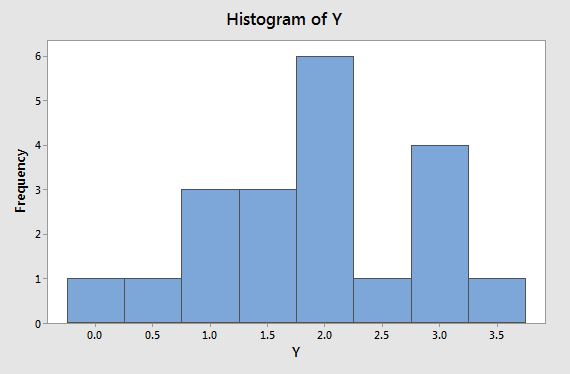
Rather than having the appearance of a normal bell curve, we might characterize this histogram as having a global maximum bar centered at 2 and a smaller local maximum bar centered at 3. It almost looks like a bimodal distribution and we would probably have some doubts that this data comes from a normal distribution (which, remember, it actually does).
By contrast, the normal probability plot below looks fine, with the points lining up along the diagonal line nicely:

By the way, it is possible to create a more normal-looking histogram for these data by adjusting the breakpoints along the axis:
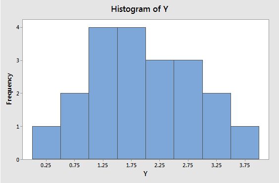
The data is exactly the same as before, but the breakpoints along the axis have been changed and the visual impression of the plot has completely changed.
Bottom line - normal probability plots are generally more effective than histograms for visually assessing normality.